creative brief
—
The MICA graphic design website serves as an important resource for students, and it can do so in a more effective way. Students should be able to find what they need within seconds.
The website should act as both a design blog as well as a help center for those that need help. The purpose of this project is to improve functionality of the site, and boost the aesthetics of the composition of the site.
The tone of the overall design for the website should be simple, straightforward, neutral, and engaging. It should not cause the users burden when they are trying to search for something.
- Goals —
- Improve navigation system
- Responsive
- Clearer hierarchies
- Better structure
The tone of the overall design for the website should be simple, straightforward, neutral, and engaging. It should not cause the users burden when they are trying to search for something.
interviews
—
Five different people (Janet Ma, Paola Mitchell, Jessica Yuan, Chelsea Alberto, and Mark Sanders) were asked four questions about their thoughts on MICA’s Graphic Design website.
After gathering all the different responses, I have come up with three different personas that summarizes the different types of people that uses the MICA graphic design website —
- Questions —
- Do you visit micagraphicdesign.com often?
- What do you like and dislike about the website?
- What do you usually visit the website for?
- What is one thing you would improve about the site?
After gathering all the different responses, I have come up with three different personas that summarizes the different types of people that uses the MICA graphic design website —
- dylan the diligent
Typical hard working college students who use the website as a source of inspiration and updates on the latest design news and projects around campus.
- amy the acquaintance
Those who only visit the website when they have to. Sometimes they may be looking for internship or study abroad posts, or simply happened to be there since it is the home page on the computers.
- otis the outsider
“We have a MICA Graphic Design Website!?” Just kidding, but a lot of students simply do not find the needs to use the website.
competitive analysis
—
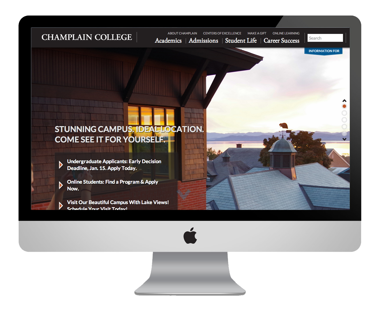
champlain college
—
Champlain college has a sophisticated and easy-to-understand one page website. It has a distinct typography hierarchy throughout, which helps guide the viewers read through the site. The site also incorporated parallax scrolling without making it chaotic. The only downside to the website is the disconnect between the navigation and the main content of the website.
responsive
● ○ ○ ○ ○ functionality
● ● ● ● ○ community
● ● ○ ○ ○ aesthetics
● ● ● ○ ○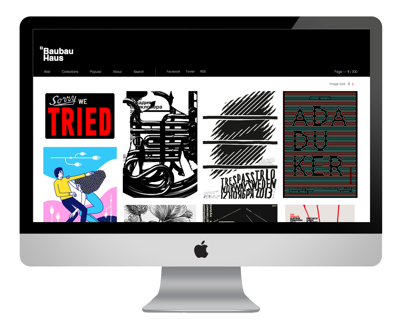
baubauhaus
—
This design blog has a simple responsive grid system to keep the focus on the images. The navigation system is also very straight forward.
responsive
● ● ● ● ● functionality
● ● ● ● ○ community
● ● ● ○ ○ aesthetics
● ● ● ● ○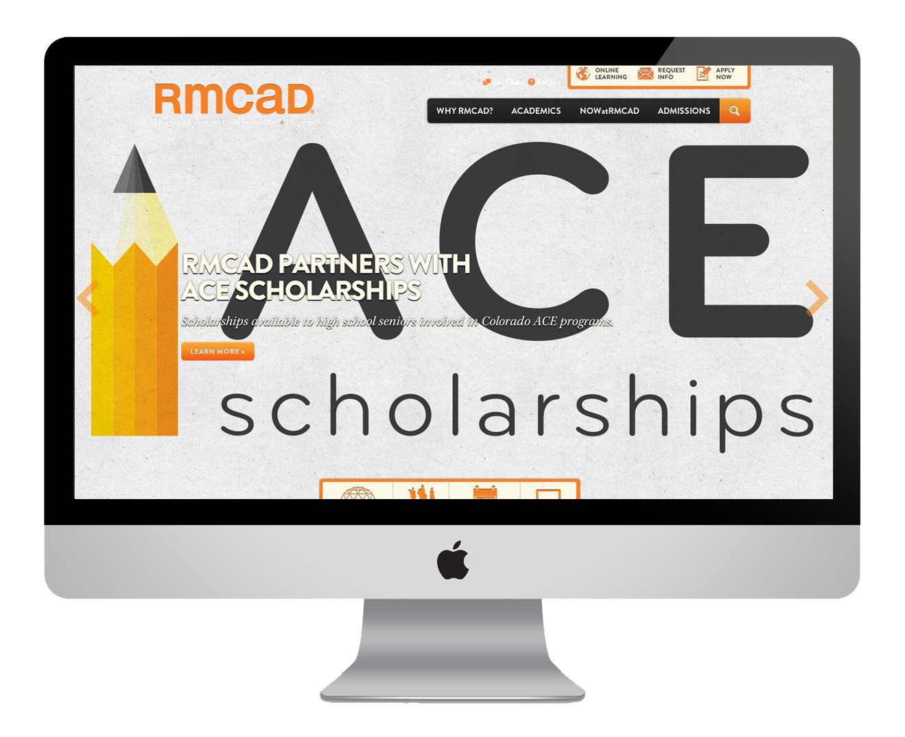
rocky mountain college of
art & design
—
This college’s website is very playful and inviting. It’s use of full width images in the background keeps the website lively, and the unified use of typography. The downside of the website is that it might get too busy with the images, and not as much content.
responsive
● ● ● ● ○ functionality
● ● ● ● ○ community
● ○ ○ ○ ○ aesthetics
● ● ● ○ ○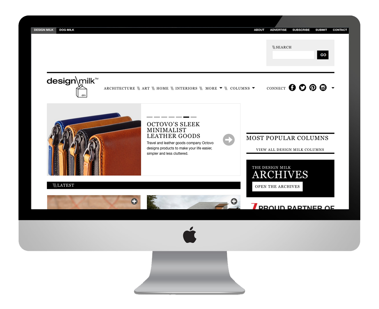
design milk
—
This design blog serves as an inspiration for designers out there. It’s functionality is similar to what MICA GD website is trying to achieve, with better visuals and aesthetics throughout the site. It has a larger active community and is updated more constantly.
responsive
● ● ● ● ○ functionality
● ● ● ● ○ community
● ● ● ● ○ aesthetics
● ● ● ● ○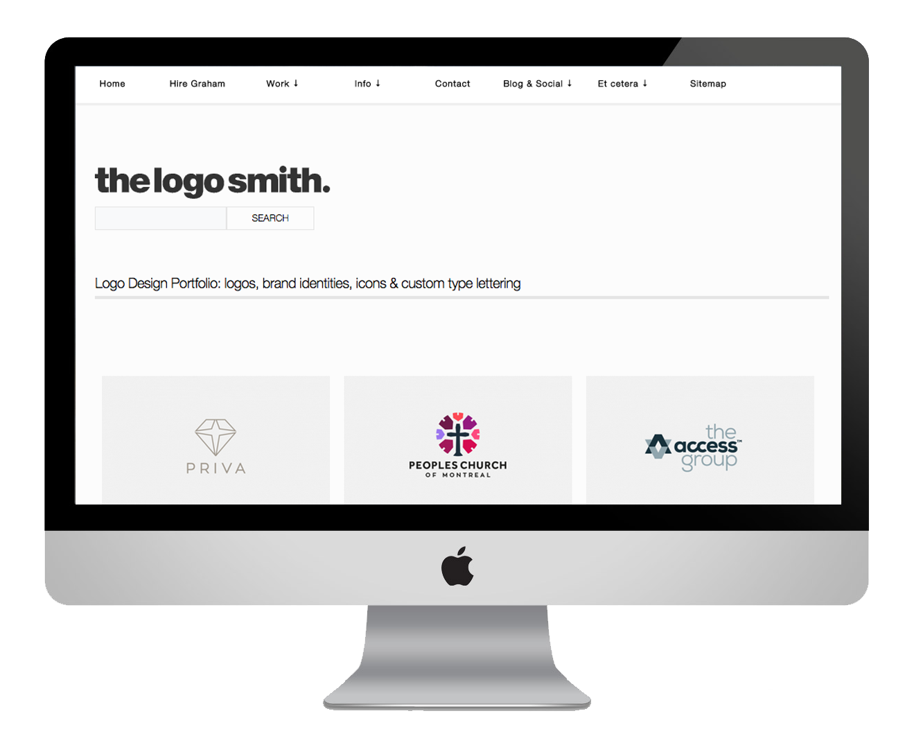
the logo smith
—
This design blog has a very simple layout and navigation system. The bright colors from the images keeps the blog looking engaging and easy to follow. There is a huge distinction with the typography between titles and paragraphs.
responsive
● ● ● ● ● functionality
● ● ● ● ○ community
● ● ● ○ ○ aesthetics
● ● ● ● ○
task list
—
- ✓ Create new design/structure of the site.
- ✓ Create a clearer navigation system.
- ✓ Select new font families & create distinct hierarchies.
- ✓ Have a distinct set of color palette.
- ✓ Reorganize placement of contents throughout the site.
- ✓ Create category selection for ease of finding specific posts.
content audit
—
- design league
- news
- events
- title
publish date
gallery
full content
- dialogue
- students
- faculties
- courses
- internship
- study abroad
- title
publish date
author
gallery
full content
- guides
- schedules
- mixtapes
- vendors
- title
publish date
gallery
full content
external links
site map
—
HOME- main navigation
- events
- blog
- current work
- profiles
- opportunities
- sub navigation
- news
- archive
- about
- contact
redesign
—
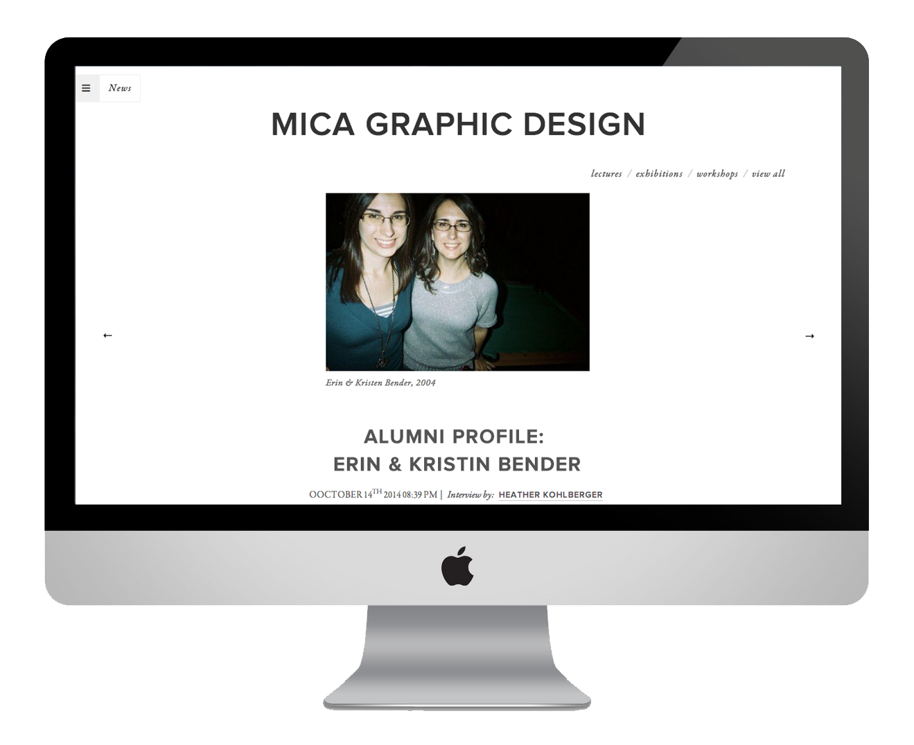
view live website
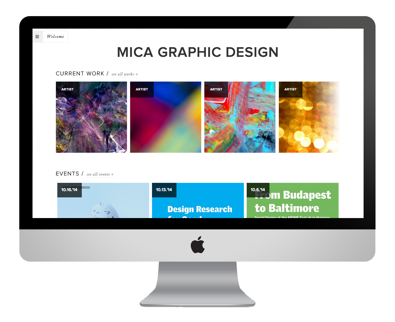
home page
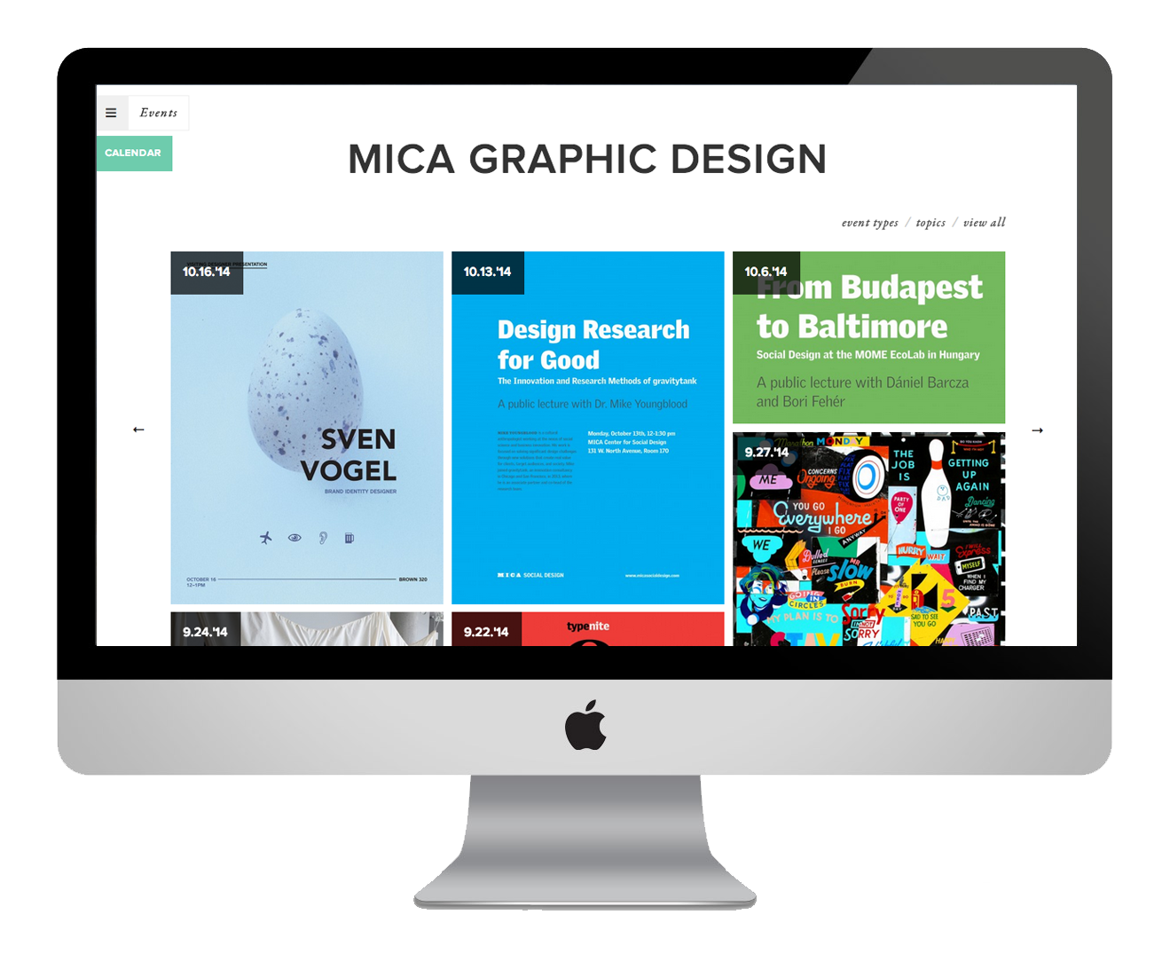
events page
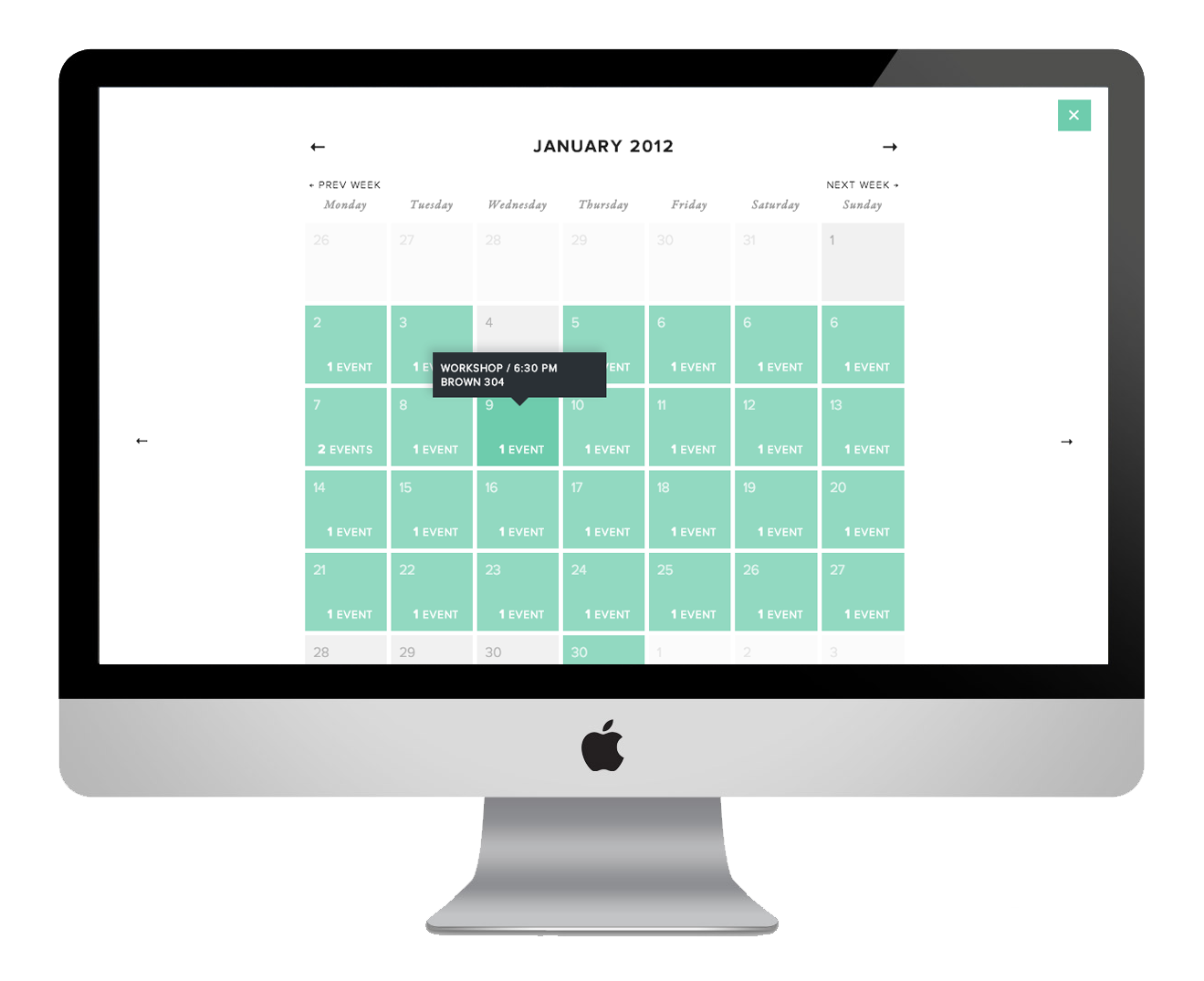
calendar page
news page
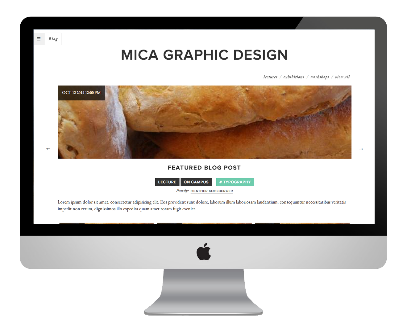
blog page
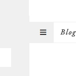
responsive navigation —
The new navigation design for the website is responsive and is hidden as to not clutter the entire web page.
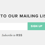
added rss feature —
Now students can sign up to be a part of the mailing list as well as subscribe to the website's RSS to get the latest updates.
new font palette —
Upgraded font palette, with Proxima Nova & Garamond, for easier readability and distinct hierarchy throughout the website.
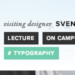
categories & tags —
Clearer identifications between categories and tags that are related to each event, image, and/or blog posts.